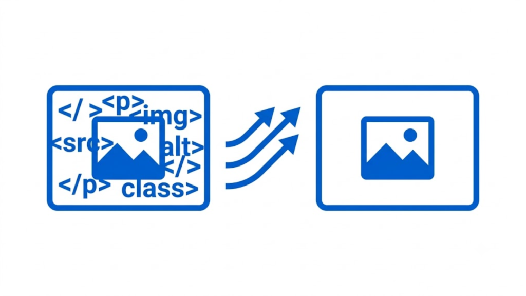
To put an image beside text in HTML, place both elements inside a container and use CSS display: flex. Flexbox is the simplest modern method for creating a side-by-side image and text layout. You can control the image width, text width, spacing, vertical alignment, and mobile behavior with CSS.
A basic example looks like this:
<div class="image-text">
    <img src="image.jpg" alt="Example image">

    <div class="text">
        <h2>Heading About the Image</h2>
        <p>
            This text appears beside the image instead of underneath it.
            You can add paragraphs, headings, links, or other HTML elements here.
        </p>
    </div>
</div>
Add CSS to place the image and text next to each other:
.image-text {
    display: flex;
    align-items: center;
    gap: 20px;
}

.image-text img {
    width: 300px;
    height: auto;
}

.text {
    flex: 1;
}
The display: flex rule makes the image and text containers sit in a row. The gap property creates space between them. align-items: center vertically centers the two elements.
Put the Image on the Left of the Text
By default, Flexbox places its children from left to right. Therefore, the image appears on the left and the text appears on the right.
<div class="image-text">
    <img src="image.jpg" alt="Product image">

    <div>
        <h2>Product Information</h2>
        <p>
            This paragraph appears directly beside the product image.
        </p>
    </div>
</div>
.image-text {
    display: flex;
    align-items: flex-start;
    gap: 24px;
}

.image-text img {
    width: 250px;
    height: auto;
}
Use align-items: flex-start when you want the top of the image to align with the top of the text instead of centering vertically.
Put the Image on the Right of the Text
To place the image on the right, use flex-direction: row-reverse.
<div class="image-text image-right">
    <img src="image.jpg" alt="Example image">

    <div>
        <h2>Text on the Left</h2>
        <p>
            The text stays on the left while the image appears on the right.
        </p>
    </div>
</div>
.image-right {
    display: flex;
    flex-direction: row-reverse;
    align-items: center;
    gap: 20px;
}

.image-right img {
    width: 300px;
    height: auto;
}
Another option is to keep the normal row direction and change the order of the individual elements with the CSS order property.
Make the Image and Text Responsive
A fixed side-by-side layout can become difficult to read on small screens. On mobile devices, the image and text often need to stack vertically.
Use a media query:
.image-text {
    display: flex;
    align-items: center;
    gap: 20px;
}

.image-text img {
    width: 300px;
    max-width: 100%;
    height: auto;
}

@media (max-width: 768px) {
    .image-text {
        flex-direction: column;
        align-items: flex-start;
    }

    .image-text img {
        width: 100%;
    }
}
This keeps the image beside the text on larger screens but places the image above the text when the screen width is 768 pixels or less. max-width: 100% also prevents the image from extending beyond its container.
Use Float When Text Should Wrap Around the Image
Flexbox is normally the better choice when you want two separate columns. However, CSS float is useful when you specifically want paragraphs to flow around an image.
<img class="article-image" src="image.jpg" alt="Example image">

<p>
    This paragraph wraps around the image. Additional text will continue
    beside the image until it reaches the bottom of the image.
</p>

<p>
    Once the text passes the image, it continues across the full available
    width of the container.
</p>
.article-image {
    float: left;
    width: 250px;
    margin: 0 20px 15px 0;
    height: auto;
}
Here, float: left moves the image to the left and allows surrounding text to flow around it. The right margin creates space between the image and text.
To put the image on the right:
.article-image {
    float: right;
    width: 250px;
    margin: 0 0 15px 20px;
}
Float is mainly appropriate for text wrapping around images, while Flexbox is more suitable for structured layouts.
Prevent Images From Breaking the Layout
Always make images responsive:
img {
    max-width: 100%;
    height: auto;
}
This prevents an image from becoming wider than its parent container. Keep the image’s alt attribute as well:
<img src="image.jpg" alt="Laptop displaying a website">
The alt text provides a text alternative for the image and is important for accessibility.
Complete Flexbox Example
For a simple production-ready image-and-text section, you can use:
<div class="image-text">
    <img src="image.jpg" alt="Team working together">

    <div class="content">
        <h2>Our Team</h2>
        <p>
            Our team works on web design, development, and digital marketing
            projects. This content appears beside the image on larger screens.
        </p>
        <a href="/about/">Learn More</a>
    </div>
</div>
.image-text {
    display: flex;
    align-items: center;
    gap: 30px;
}

.image-text img {
    width: 40%;
    max-width: 400px;
    height: auto;
}

.image-text .content {
    flex: 1;
}

@media (max-width: 768px) {
    .image-text {
        flex-direction: column;
        align-items: flex-start;
    }

    .image-text img {
        width: 100%;
        max-width: 100%;
    }
}
This approach works for product sections, team profiles, service descriptions, blog content, landing pages, and other common website layouts.
Which Method Should You Use?
Use Flexbox when you want an image and a text block arranged beside each other as a structured layout. Use float when you specifically want normal paragraph text to wrap around an image. For most modern website designs, Flexbox provides better control over alignment, spacing, sizing, and responsive behavior.
The essential HTML does not change: put the image and text inside the same container, then use CSS to control how they are positioned.
Why Not Read This?
How To Center An Iframe In Html
How To Change Plain Text Email To Html
How To Make Text Wrap Around An Image In Html
Are Html And Css Programming Languages
Do My Html Homework
How To Add Alt Tags To Images In Html
How To Create Multiple Web Pages In Html
How To Import An Html File Into Excel
How To Integrate WordPress Blog Into Html Website
How To Link A Css File To An Html File
How To Make More Than One Page In Html